The most advancedUI Kit & Design System
A scalable UI ecosystem powered by Plus UI’s design system and UI kits, built to support designers from concept to delivery.

Design Fast, Scale Smarter
From solo projects to enterprise solutions, create once and deliver consistent UI everywhere.
Smart Token Architecture
Accelerate delivery with a responsive, token-powered design system. Every layout is tested across screen sizes and built with accessibility, scalability, and performance in mind.
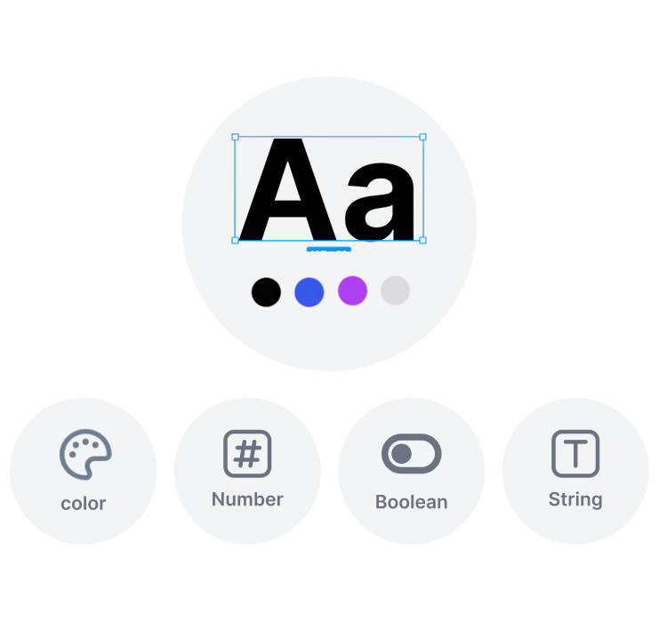
Comprehensive Fundamentals
Gain access to a complete set of UI foundations—color tokens, typography, grids, and spacing—crafted to help you build cohesive, enterprise-ready interfaces.
Built for Every Device
Deliver seamless experiences across desktops, tablets, and mobile. Every component in Plus UI is optimized for responsiveness, ensuring your product looks and performs flawlessly on any screen size.

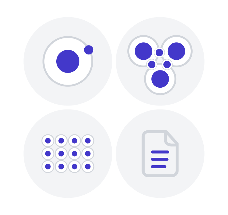
Atomic Design System
Scale from simple components to robust design systems. Plus UI grows with your team, supporting projects from first launch to enterprise-level products.
Future-Ready Design System
Standardize your design language and scale it across frameworks, teams, and platforms.
Scalable
Whether you're designing for one product or a full suite, Plus UI adapts. Customize every aspect—styles, structures, tokens—to fit your unique brand and product needs.

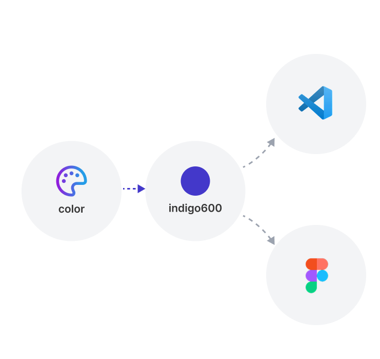
Semantic Token Naming
Extendable and flexible for integrations with popular tools like FontAwesome and Tailwind CSS.

Auto Layout 5.0
Ensure your projects meet WCAG 2.11 standards, providing top-tier accessibility for all users.

Robust Documentation
Comprehensive guidelines, usage rules, and best practices make onboarding faster and keep design decisions aligned.

Powerful Design System
Plus UI brings together tokens, components, and guidelines into one scalable system—ensuring visual and functional consistency, accelerating design and development workflows, reducing duplication of effort, and creating a seamless bridge between designers, developers, and product teams through clarity and shared standards.
Consistency
Unified tokens ensure consistency everywhere.
Faster Releases
Reusable components speed up design cycles.
Designers Onboard
Trusted by design-led teams and solo creators worldwide.
Less Design Revision
Streamlined handoffs cut review loops, speed up delivery.
UI Knowledge Hub
Explore expert-curated documentation, assets
and UI strategies built for modern product teams.

Documentation
Comprehensive guides to help you build, customize, and scale your UI with confidence.

Blog
Expert insights, best practices trends to keep your team ahead in design and development.

Community
Connect with designers to ask your questions and grow together.
Trusted by 20,000+ users
What People Are Saying
Designers, developers, and product teams
rely on Plus UI to move faster and stay consistent.

Plus UI transformed our workflow.
"From design to deployment, Plus UI has given our team the tools we need to stay consistent. The ready-to-use systems saved us weeks of work, and the cross-framework support made adoption seamless."
Sarah Lee
Lead Frontend Engineer

A true game-changer for design consistency.
"Plus UI completely transformed how our team works. With shared tokens and reusable components, we cut design revisions by more than half and now maintain perfect brand consistency across all our products."
Emma Davis
Lead Product Designer

Simply the Best.
"Accessible power and flexible workflows-code scales with your team. supporting growth, and ensuring that collaboration remains smooth as projects expand and evolve."
James Frank
Product Manager

Got a question?
Everything you need to know about how Plus UI works,
what's included, and how to get started.
Where Ideas Turn Into Systems
Design Smarter.
Scale Faster.
Plus UI gives designers everything they need to stay consistent,
collaborate better, and bring ideas to life—faster than ever