Plus UI
User User User
Trusted by 20,000+ developers

A future-ready UI library workswherever HTML works

Design, build, and scale consistent interfaces across multiple frameworks, powered by a fully integrated design system and UI library for seamless collaboration and faster delivery.

Github Start for free
Features

Code Less, Deliver More

A framework-agnostic UI library powered by Web Components
—engineered for performance, flexibility, and scalability.
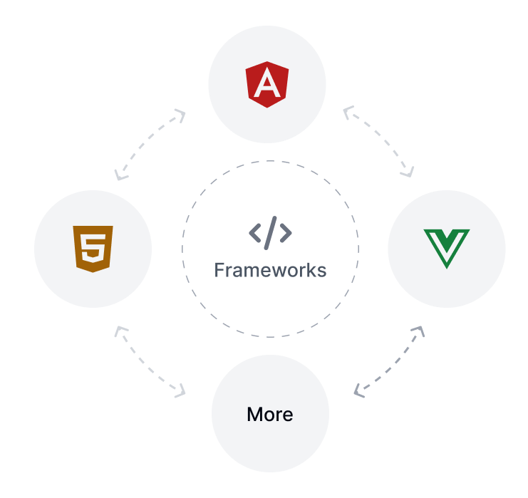
Multi-Framework

Build once, run anywhere. Plus UI works across React, Vue, Angular, and beyond—offering flexibility without sacrificing consistency.

Multi-Framework

Pre-Built Structure

Jumpstart projects with ready-to-use layouts and patterns that keep design and development aligned for faster delivery.

Pre-Built Structure

Theming & Customisation

Tailor every component to match your brand. Adjust themes, tokens, and styles instantly for full creative control.

Theming & Customisation

Seamless Pixel-Perfect Handoff

Ensure flawless collaboration between design and development with shared tokens and perfectly synced components.

Seamless Pixel-Perfect Handoff
Specifications

Developed for Developers

Whether you're building a simple dashboard or an enterprise-grade platform,
the Plus UI Library empowers developers to move fast, stay consistent, and scale cleanly.

Clean, Maintainable Code

Crafted with developer experience in mind — modular architecture, readable syntax, and well-documented components keep your codebase scalable.

Token Architecture

Keyboard Support

Native keyboard support for every component — no extra setup required.

Keyboard Support

WAI-ARIA Compliant

Every component is built to meet WCAG and WAI-ARIA standards, ensuring accessible experiences out of the box.

Accessibility of WCAG

Comprehensive Documentation

A single, structured source combining components, guidelines, and examples — making it easy to learn, apply, and scale.

Explore the Documentation
Token Architecture
Features

The Fastest
Web Component UI Library

Plus UI combines tokens, components, and guidelines into a unified system powered by Lit and Tailwind CSS. It delivers lightning-fast rendering, seamless scalability, and cross-framework flexibility — helping teams design, develop, and deploy at unmatched speed.

Render Time

0,2Sec

Ultra light web component optimised for instant load

Faster Delivery

Ship quicker with reusable UI components and blocks

Framework Agnostic

Compatible with React, Vue, and all modern frameworks.

Less Code Rework

Reusable components eliminate redundant builds

Resources

UI Knowledge Hub

Explore expert-curated documentation, assets
and UI strategies built for modern product teams.

Documentation

Documentation

Comprehensive guides to help you build, customize, and scale your UI with confidence.

Blog

Blog

Expert insights, best practices trends to keep your team ahead in design and development.

Community

Community

Connect with designers to ask your questions and grow together.

User User User

Trusted by 20,000+ users

What People Are Saying

Designers, developers, and product teams
rely on Plus UI to move faster and stay consistent.

Sarah Lee

Plus UI transformed our workflow.

"From design to deployment, Plus UI has given our team the tools we need to stay consistent. The ready-to-use systems saved us weeks of work, and the cross-framework support made adoption seamless."

Sarah Lee

Lead Frontend Engineer

Emma Davis

A true game-changer for design consistency.

"Plus UI completely transformed how our team works. With shared tokens and reusable components, we cut design revisions by more than half and now maintain perfect brand consistency across all our products."

Emma Davis

Lead Product Designer

James Frank

Simply the Best.

"Accessible power and flexible workflows-code scales with your team. supporting growth, and ensuring that collaboration remains smooth as projects expand and evolve."

James Frank

Product Manager

Company LogoCompany LogoCompany LogoCompany LogoCompany LogoCompany LogoCompany Logo
FAQ

Got a question?

Everything you need to know about how Plus UI works,
what's included, and how to get started.

The PlusUI Component Library is a collection of reusable UI components that can be used to build modern, responsive user interfaces efficiently. It focuses on accessibility, customization, and multi-framework compatibility, making it suitable for projects of all sizes.
Yes, PlusUI is an excellent choice for React projects. It provides customizable, accessible components that integrate seamlessly into React applications, helping developers build interfaces faster and more efficiently.
Absolutely. PlusUI works across multiple frameworks, including Angular, Vue, and Svelte, allowing developers to build consistent and high-quality user interfaces regardless of the framework they choose.
PlusUI prioritizes accessibility, ease of use, customization, and multi-framework support. Unlike more rigid libraries, it offers flexibility while maintaining a consistent and modern design approach.
A component library is a collection of reusable UI elements used to build applications efficiently. PlusUI fits this definition by offering ready-made components like buttons, forms, modals, and navigation elements that ensure consistency and reduce development time.

Where Ideas Turn Into Reality

Built for Every Stack.
Designed for Speed

A framework-agnostic UI library that helps teams scale
efficiently across React, Vue, and beyond.

Join to our newsletter

Join to our popular weekly newsletter Plus UI, packed with updates, tips on UX and get the latest news in your inbox.

Join now

© Plus UI 2026

Plus UI offers an integrated Design System and UI Library, featuring a versatile suite of components to elevate your development projects. We streamline the web app development process with fully customizable pre-built components, themes, and powerful integrations.

Our components are built on a centralized token architecture, ensuring consistency and efficiency across your design system and UI library. The UI Library's framework-agnostic technology allows seamless use of components across different frameworks. Optimized for speed, it offers fast loading times, high performance, and quick integration, making it the fastest component library for web applications. The token architecture ensures theming consistency, covering essential design aspects like Color, Typography, Icons, Borders, Spacing, Opacity, Shadows & Effects, and Breakpoints. Integrations with Tailwind CSS and Font Awesome enhance functionality. Ready-to-use themes include light and dark modes, with full customization to apply your branding. Plus UI is also compliant with WCAG 2.1 standards for accessible web design.

We have meticulously designed and developed a collection of 26 feature-rich core components, with over 2000 variants and more than 2000 free icons in our Freemium Plan. For more advanced needs, our Pro Plan provides access to professionally designed and developed components, blocks, and templates. Our core components include: Accordion, Alert, Avatar, Badge, Button, Button Group, Breadcrumb, Checkbox, Chip, Divider, Drawer, Dropdown, Input, Link, Modal, Progress, Popconfirm, Popover, Radio, Rating, Select, Tabs, Textarea, Toast, Toggle, and Tooltip. Advanced components feature Charts, Date & Time Pickers, Data Grids, and Tree Views. The Plus UI component library offers a robust and flexible solution for building user interfaces, with support for React, Vue.js, Angular, Svelte, Next.js, and other frameworks.

How We Differ from Other Market Providers:

Plus UI sets itself apart from other UI libraries and design systems. While systems like IBM's Carbon Design System excel in scalability for enterprise use, Plus UI integrates a centralized token system that unifies the design system and UI library, enhancing consistency and efficiency.

Unlike the Atlassian Design System, which focuses on simplicity for enterprise solutions, Plus UI provides a rich set of customizable and accessible components powered by Tailwind CSS and Font Awesome, ensuring a lightweight and flexible design framework.

The Figma Design System is known for its powerful collaboration features. Plus UI complements these by offering a meticulously organized suite of components compatible with Figma, allowing designers to leverage advanced features alongside our extensive library.

For Salesforce developers, the Lightning Design System offers robust tools. Plus UI provides similar robustness but extends its versatility by supporting multiple frameworks like React, Angular, Vue, and Svelte, making it adaptable to a wider range of applications.

The Airbnb Design System emphasizes user-centric principles. Plus UI builds on this with a centralized token system that enhances design coherence, ensuring all components adhere to consistent standards.

Apple’s Design System is celebrated for its sleek aesthetics and high performance. Plus UI matches this standard while providing a vast array of fully customizable and accessible components, including support for dark themes.

Atomic Design focuses on breaking down UIs into smaller, reusable components. Plus UI extends this approach with over 2000 variants and a rich set of properties and tokens, enabling efficient development of complex interfaces.

The IBM Design System is known for its comprehensive guidelines and accessibility. Plus UI offers user-friendly, accessible interfaces with detailed documentation and a component library that boosts productivity and design consistency.

The Salesforce Lightning Design System is optimized for Salesforce applications. Plus UI offers broader integrations, making it suitable for various frameworks beyond Salesforce, providing greater versatility.

Google's Material Design is a cohesive framework for responsive, mobile-first interfaces. Plus UI supports these principles but distinguishes itself with a lightweight package and a powerful combination of Tailwind CSS and Font Awesome for enhanced customization.

The Google Design System pioneered modern design principles. Plus UI builds on these by offering a comprehensive and highly adaptable system that caters to a broader range of needs.

The Uber Design System focuses on accessibility for a global user base. Plus UI shares this focus and expands on it by providing fully customizable components tailored to diverse user needs.

Microsoft's Fluent Design System emphasizes light, depth, and motion. Plus UI incorporates these principles while providing an extensive library of easy-to-use components for a seamless development process.

Finally, the Ant Design System is popular for its robust components in enterprise environments. Plus UI offers similar robustness but stands out with its centralized token system, extensive component library, and multi-framework compatibility, making it ideal for a wide range of applications.

In essence, Plus UI combines the strengths of these renowned design systems while offering unique features like a centralized token system, extensive customization, and framework-agnostic components, setting it apart as a versatile and powerful solution.

Plus UI Logo Plus UI

Copyright © 2026 Plus UI Inc. All rights reserved.