Plus UI
User User User
Trusted by 20,000+ designers

AI‑PoweredUI Creation in Your IDE

Plus UI MCP allow you build interfaces in your IDE with AI — using Plus UI’s themes, blocks, and components for fast, refined results.

Start for free
Plus AI interface showing AI-powered UI generation in an IDE
Showcase

Creative Interfaces in Seconds

Integrate Plus AI in your IDE to craft stunning Tailwind CSS
components, blocks, and pages.

Build Smarter, Faster

Design and generate responsive layouts fast.

Discover and Adapt

Explore ideas and smart design patterns.

Perfect and Optimise

Enhance visuals and ensure consistency.

Plus AI Showcase

10X Faster Builds

Generate blocks and pages instantly with a simple prompt—right inside your IDE.

Works with Your Stack

Seamlessly works with React, Next.js, Vue, pure HTML, and more.

AI-Powered UI, Instantly

Build stunning UIs with AI inspired by Plus UI.

Specifications

Build with your stack

Works seamlessly with React, Next.js, Vue,
Pure HTML and more.

Context-Aware UI Suggestions

Intelligent UI prompts that adapt based on your code context and existing styles.

Token Architecture

Build with your stack

Works seamlessly with React, Next.js, Vue, Pure HTML and more.

Powerful Integrations

AI-Inspired UI

Instantly build beautiful UIs with AI that draws inspiration from Plus UI.

Accessibility of WCAG

Theming & Variant Generation

Generate multiple theme and variant versions on demand without manual rewrites.

Explore Themes
Token Architecture
Supported IDEs

Integrate with Your Favorite IDE

A Few Easy Steps to Get Plus UI MCP Up and Running in Your IDE

VS Code
VS Code
Cursor
Cursor
Windsurf
Windsurf
Cline
Cline
Technology Support

Universal Framework & IDE Compatibility

Fully compatible wherever Tailwind CSS and your toolchain run—VS Code, JetBrains, Cursor, and more. Explore MCP guides to connect Plus MCP as an agent/plugin and automate UI tasks across frameworks and build tools.

Technology Support
Examples

Powered by Plus AI

Build UI blocks or full pages with premium Tailwind CSS
components and themes inspired by Plus UI.
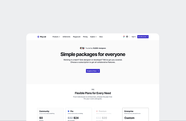
Landing Page
Next.js

Landing Page

Create professional SaaS landing pages that effortlessly showcase your MVP with clear calls to action and powerful visuals.
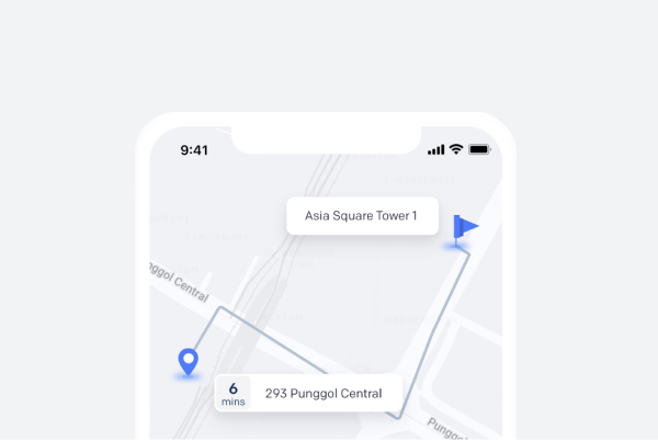
Tracking App
Vue.js

Tracking App

Monitor your health, track vital signs, calories, and daily activity. Get personalized health recommendations
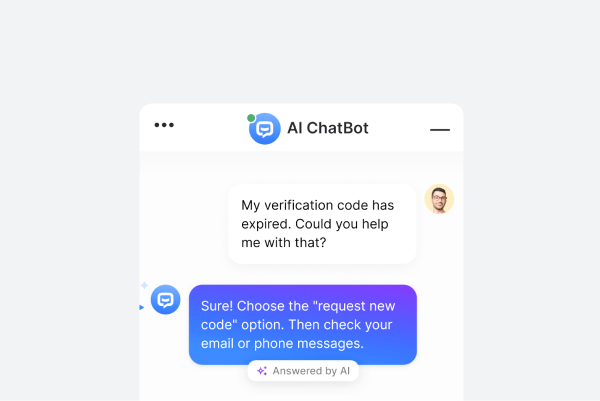
AI Chatbot
Angular.js

AI Chatbot

Deploy an AI-powered chatbot to provide instant customer support trained on your data.

User User User

Trusted by 20,000+ users

What People Are Saying

Designers, developers, and product teams
rely on Plus UI to move faster and stay consistent.

Sarah Lee

Plus UI transformed our workflow.

"From design to deployment, Plus UI has given our team the tools we need to stay consistent. The ready-to-use systems saved us weeks of work, and the cross-framework support made adoption seamless."

Sarah Lee

Lead Frontend Engineer

Emma Davis

A true game-changer for design consistency.

"Plus UI completely transformed how our team works. With shared tokens and reusable components, we cut design revisions by more than half and now maintain perfect brand consistency across all our products."

Emma Davis

Lead Product Designer

James Frank

Simply the Best.

"Accessible power and flexible workflows-code scales with your team. supporting growth, and ensuring that collaboration remains smooth as projects expand and evolve."

James Frank

Product Manager

Company LogoCompany LogoCompany LogoCompany LogoCompany LogoCompany LogoCompany Logo
FAQ

Got a question?

Everything you need to know about how Plus UI works,
what's included, and how to get started.

PlusUI is a robust UI component library designed to help developers build modern, responsive, and accessible user interfaces with ease. It stands out due to its focus on flexibility, easy integration, and comprehensive customization options, similar to Mantine and Chakra UI, but with a lighter footprint.
PlusUI is ideal for developers looking for a reliable and feature-rich UI toolkit, whether you're building a simple project or a complex application. PlusUI’s documentation and ease of integration make it suitable for beginners and professionals alike, similar to Ant Design and MUI.
PlusUI is built with accessibility (a11y) in mind, ensuring all components adhere to the Web Content Accessibility Guidelines (WCAG). We provide ARIA attributes and keyboard navigation support out-of-the-box, similar to Material UI and Fluent UI.
Yes, PlusUI is flexible enough for both personal and enterprise-grade projects. It provides scalable components that can adapt to various project sizes, much like the enterprise-level compatibility offered by Kendo UI and PrimeNG.
You can access the complete PlusUI documentation on our website. It includes comprehensive guides, examples, and API references to help you implement each component, similar to the thorough documentation available for Tailwind CSS and Bootstrap.

Turning Ideas Into Ready-to-Use UI

Turning Prompts Into
Production Ready UI

Generate, refine, and ship intelligent UI directly from your ID
powered by Plus UI MCP.

Join to our newsletter

Join to our popular weekly newsletter Plus UI, packed with updates, tips on UX and get the latest news in your inbox.

Join now

© Plus UI 2026

Plus UI offers an integrated Design System and UI Library, featuring a versatile suite of components to elevate your development projects. We streamline the web app development process with fully customizable pre-built components, themes, and powerful integrations.

Our components are built on a centralized token architecture, ensuring consistency and efficiency across your design system and UI library. The UI Library's framework-agnostic technology allows seamless use of components across different frameworks. Optimized for speed, it offers fast loading times, high performance, and quick integration, making it the fastest component library for web applications. The token architecture ensures theming consistency, covering essential design aspects like Color, Typography, Icons, Borders, Spacing, Opacity, Shadows & Effects, and Breakpoints. Integrations with Tailwind CSS and Font Awesome enhance functionality. Ready-to-use themes include light and dark modes, with full customization to apply your branding. Plus UI is also compliant with WCAG 2.1 standards for accessible web design.

We have meticulously designed and developed a collection of 26 feature-rich core components, with over 2000 variants and more than 2000 free icons in our Freemium Plan. For more advanced needs, our Pro Plan provides access to professionally designed and developed components, blocks, and templates. Our core components include: Accordion, Alert, Avatar, Badge, Button, Button Group, Breadcrumb, Checkbox, Chip, Divider, Drawer, Dropdown, Input, Link, Modal, Progress, Popconfirm, Popover, Radio, Rating, Select, Tabs, Textarea, Toast, Toggle, and Tooltip. Advanced components feature Charts, Date & Time Pickers, Data Grids, and Tree Views. The Plus UI component library offers a robust and flexible solution for building user interfaces, with support for React, Vue.js, Angular, Svelte, Next.js, and other frameworks.

How We Differ from Other Market Providers:

Plus UI sets itself apart from other UI libraries and design systems. While systems like IBM's Carbon Design System excel in scalability for enterprise use, Plus UI integrates a centralized token system that unifies the design system and UI library, enhancing consistency and efficiency.

Unlike the Atlassian Design System, which focuses on simplicity for enterprise solutions, Plus UI provides a rich set of customizable and accessible components powered by Tailwind CSS and Font Awesome, ensuring a lightweight and flexible design framework.

The Figma Design System is known for its powerful collaboration features. Plus UI complements these by offering a meticulously organized suite of components compatible with Figma, allowing designers to leverage advanced features alongside our extensive library.

For Salesforce developers, the Lightning Design System offers robust tools. Plus UI provides similar robustness but extends its versatility by supporting multiple frameworks like React, Angular, Vue, and Svelte, making it adaptable to a wider range of applications.

The Airbnb Design System emphasizes user-centric principles. Plus UI builds on this with a centralized token system that enhances design coherence, ensuring all components adhere to consistent standards.

Apple’s Design System is celebrated for its sleek aesthetics and high performance. Plus UI matches this standard while providing a vast array of fully customizable and accessible components, including support for dark themes.

Atomic Design focuses on breaking down UIs into smaller, reusable components. Plus UI extends this approach with over 2000 variants and a rich set of properties and tokens, enabling efficient development of complex interfaces.

The IBM Design System is known for its comprehensive guidelines and accessibility. Plus UI offers user-friendly, accessible interfaces with detailed documentation and a component library that boosts productivity and design consistency.

The Salesforce Lightning Design System is optimized for Salesforce applications. Plus UI offers broader integrations, making it suitable for various frameworks beyond Salesforce, providing greater versatility.

Google's Material Design is a cohesive framework for responsive, mobile-first interfaces. Plus UI supports these principles but distinguishes itself with a lightweight package and a powerful combination of Tailwind CSS and Font Awesome for enhanced customization.

The Google Design System pioneered modern design principles. Plus UI builds on these by offering a comprehensive and highly adaptable system that caters to a broader range of needs.

The Uber Design System focuses on accessibility for a global user base. Plus UI shares this focus and expands on it by providing fully customizable components tailored to diverse user needs.

Microsoft's Fluent Design System emphasizes light, depth, and motion. Plus UI incorporates these principles while providing an extensive library of easy-to-use components for a seamless development process.

Finally, the Ant Design System is popular for its robust components in enterprise environments. Plus UI offers similar robustness but stands out with its centralized token system, extensive component library, and multi-framework compatibility, making it ideal for a wide range of applications.

In essence, Plus UI combines the strengths of these renowned design systems while offering unique features like a centralized token system, extensive customization, and framework-agnostic components, setting it apart as a versatile and powerful solution.

Plus UI Logo Plus UI

Copyright © 2026 Plus UI Inc. All rights reserved.